The Sign That Meets the Westerly: Exterior Signage for Highland Premises
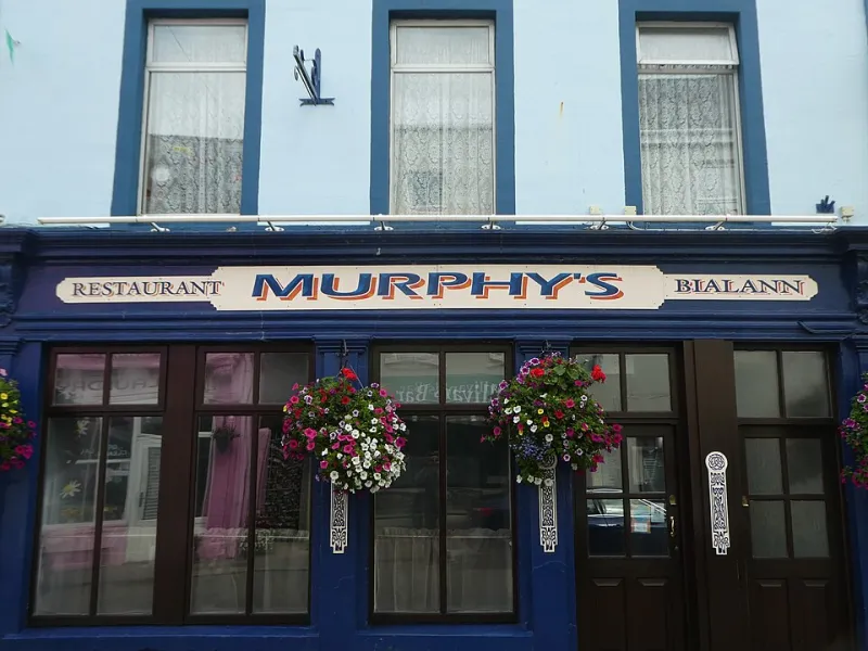
Photo: Mucklagh, CC BY-SA 4.0, via Wikimedia Commons
In Inverness, a sign can look perfectly respectable in July and decidedly tired by the end of February. That is rarely a design failure. It is usually a failure to treat the sign as a piece of small architecture rather than a poster that has been asked to stand still. A Highland exterior sign has to cope with salt on the road, wind that arrives from the side, low winter light and a fair amount of damp. Ordering one well is less about picking a nice font and more about matching material, fixing and maintenance to the place it will live.
Start with the wall, not the artwork
Before anyone opens a design file, look at where the sign is going. Is it a flat fascia above a shop in Inverness city centre, a gatepost at the end of a farm track near Beauly, a painted board on a village hall in Easter Ross, or a totem by a car park in Ullapool? Each surface behaves differently. Render can be uneven and crumbly. Timber moves. Corrugated cladding has ridges that will not take a flush panel kindly. Stone needs different anchors from brick. Glass needs care, and sometimes a sign that hangs rather than penetrates.
Take photographs with a scale — a metre rule or a person — and note the aspect. A sign ordered from a rough phone snap and a guessed width is a sign that comes back. If the building is listed, or in a conservation area, check what consent is needed before the artwork is finalised. That is dull, but it is cheaper than a beautiful panel that cannot go up.
Materials for a salty, sideways-rain climate
For most Highland shopfronts, aluminium composite is the dependable middle ground. It is rigid, flat, reasonably light and takes printed graphics or applied letters well. Powder-coated steel is tougher again, but chips need attention and the coast is not kind to ordinary steel. High-pressure laminate is a good fit for panels that will be handled or wiped, and it holds colour well. Acrylic looks crisp for smaller signs, though it can be brittle in extreme cold and should not be over-tightened.
Printed vinyl has its place, but only as part of a proper system. Cast vinyl on a prepared, suitable substrate can last well. Cheap calendered vinyl on damp timber is an annual subscription to reprinting. Near the west coast, specify marine-grade or 316 stainless fixings and avoid mixing metals where corrosion can start. UV-stable inks and a protective laminate are not upsells in this climate; they are what stop a red sign going pink by the second summer.
The fixing is the sign
Most failures I see are not the panel. They are the thing holding the panel. Use stainless steel fixings suitable for the location, nylon washers to separate dissimilar metals, and slotted or oversized holes that allow the material to expand and contract. Leave a small gap rather than clamping everything down hard. A sign that is fixed tight to a moving timber wall will crack or bow.
For heavier panels, talk to the installer about brackets and stand-offs before the sign is made. A fascia sign may need a hidden frame; a gatepost sign may need a backboard and posts set in concrete; a village hall notice case may need hinges that still work after a winter. If the sign is going high, plan how it will be cleaned and checked. A lovely panel that needs a cherry picker for a routine wipe is a panel that will be ignored.
Reading distance and road speed
Legibility is not just letter height, but letter height is a useful start. A rough rule of thumb is 25mm of capital letter height for every 3m of viewing distance. A sign read from 30m wants letters around 250mm high. A sign read at 60mph needs far more than that, and it needs fewer words. The best road-side signs say one thing: the name, the turn, the service. They do not try to fit in opening hours, a slogan and a QR code.
For a village hall or a shop window, the viewing distance may be a few metres, but the competition is different: clutter, reflections and low winter sun. Strong contrast matters more than a fashionable palette. Dark text on a light background, or the reverse, with generous spacing. Test the design at the actual size, or at least print a section to scale and stick it on the wall. A logo that looks elegant on a laptop can turn to mush at 200mm wide.
What to bring to the printer
An exterior sign order goes more smoothly with a short brief rather than a long email chain. Bring photographs of the wall, measured dimensions, the surface type, the viewing distance, and a note of who is installing. If the sign is going near the coast, say so. If it is on a listed building, say that too. Supply logos as vector files where possible, or a clean high-resolution original. A screenshot of a website header is not artwork; it is a rumour of artwork.
Ask for a proof that shows the actual proportions and colours, and for a sample of the material if you are unsure. For a large panel, a full-size paper proof taped to the wall for an afternoon is a cheap way to catch a mistake. It also shows how the sign will sit in the light. Approve fixings and finish at the same time as the artwork, not after the panel has been made.
Salt, sun and the slow fade
Salt does not need to be sprayed directly on a sign to cause trouble. It arrives in damp air, sits in crevices and starts working on fixings. UV does the rest, especially on south-facing panels and at altitude. A sign that faces the prevailing wind will take more punishment than one tucked under an eaves. That is worth knowing before you choose a finish.
A simple wash with mild soap and water, avoiding abrasive pads, does more than most people think. Rinse thoroughly. Do not use a pressure washer close up on edges or applied letters. Check for chipped paint, lifted edges and loose screws after gales. Keep a small box of matching fixings and touch-in paint. If a fixing has started to corrode, replace it before it stains the panel.
A maintenance loop that takes an hour
Put a reminder in the diary for a quarterly walk-round: once in spring, once before winter, and after any named storm that makes the news. Look at the top edge, the bottom edge, the fixings and the wall. Is water sitting behind the panel? Is a bracket pulling away? Has a letter lifted at one corner? A small repair in October is cheaper than a new sign in January.
The goal is not to baby the sign. It is to stop a series of tiny failures turning into an annual reprint. In a Highland year, a sign earns its keep by being a little dull: well fixed, well finished, easy to read and easy to check. The drama can stay in the weather.