A Card in the Coat Pocket: Printing Shuttle Timetables for Highland Days
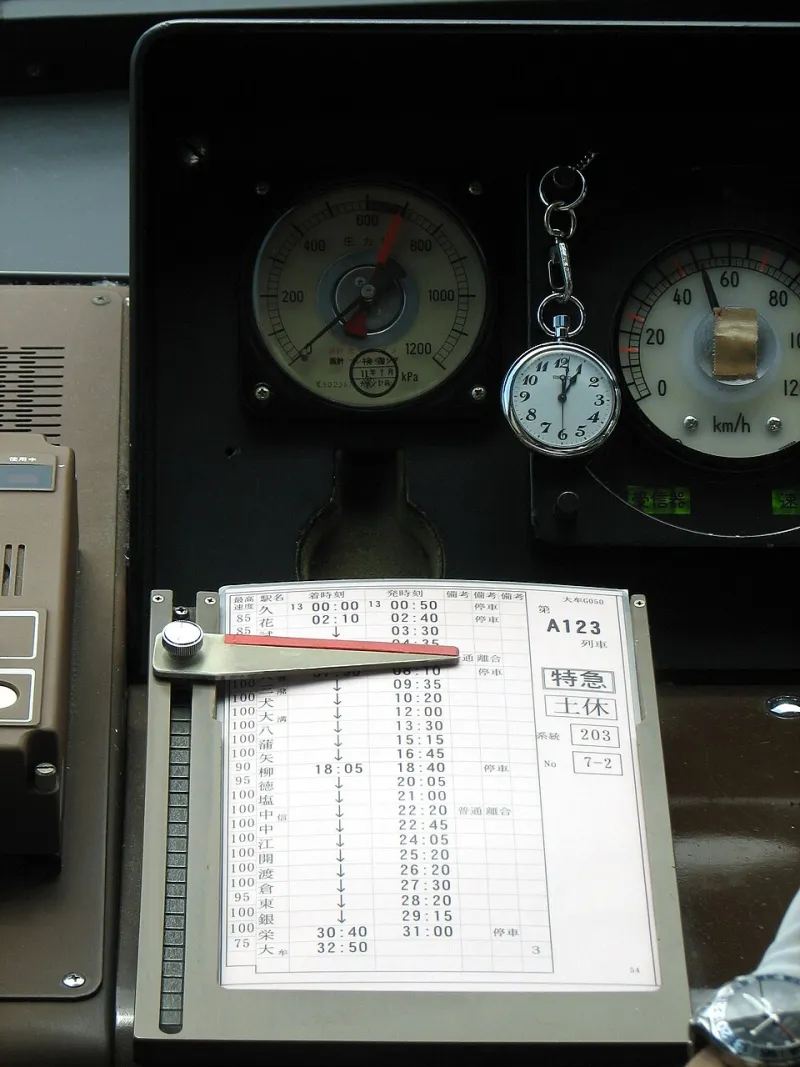
Photo: Chris 73, CC BY-SA 3.0, via Wikimedia Commons
There is a particular kind of Highland travel moment that no app quite solves. You are at a ferry terminal, or outside a village hall, or waiting by a hotel door with a suitcase in one hand and a phone in the other. The screen is dim because you have been taking photos all day. The signal is patchy. Your gloves are wet. What you want is not a login, a download or a QR code that opens a PDF at 3G speed. What you want is a small piece of paper that tells you when the next shuttle leaves.
That is not an argument against digital timetables. They are useful, updatable and cheap to change. But for small transport operators and visitor services across the Highlands, a printed pocket timetable does a different job. It is a backup, a welcome, a piece of local reassurance. And if it is planned properly, it can last a whole season without turning into wet pulp in somebody's coat pocket.
The phone is not the whole timetable
Visitors arrive in the Highlands with all sorts of assumptions about connectivity. Some have roaming switched off. Some have batteries that lose their edge in the cold. Some are simply of a generation that still likes to hold a timetable and read it without pinching the screen. None of that means they cannot use a phone. It means the phone should not be the only place the information exists.
A printed card also does something subtle: it makes the service feel established. A shuttle operator with a tidy pocket timetable looks organised. A B&B that can hand one over at breakfast looks helpful. A ferry terminal with a small stack by the door looks like it knows what happens next. Those are small signals, but they matter when someone is trying to work out whether they can catch the last run back from town.
Start with the fold, not the artwork
The most common mistake with pocket timetables is designing a poster and then shrinking it. That rarely works. A timetable needs to be read at a glance, often while standing up, sometimes in poor light. The format should come first.
For most shuttle routes, a single card with one clean fold is the sensible starting point. Folded, it should slip into a jacket pocket or a back jeans pocket without being folded again by the user. Open, it should show the route and the main stops on one side, with times and direction on the other. If there are several routes, a concertina fold can work, but only if each panel is clearly labelled. Once you get past four panels, people start opening the whole thing like a map and losing their place.
Think about the hand that will hold it. A tall, narrow card is easy to keep in a pocket. A square card feels more like a leaflet and less like something you keep. Rounded corners are a small detail that makes a difference over a season. They stop the card from catching on fabric and curling at the edges.
Paper that can take a damp day
A timetable is not a brochure. It is a working document. That means the paper stock needs to be chosen for pockets, not for the printer's sample book.
A sturdy 300gsm to 350gsm board is a good baseline. It has enough body to survive being pulled in and out of a pocket, and it does not flop about in the wind. A matt lamination helps with damp, but too much gloss can make the card slippery in wet gloves and difficult to read under certain lights. A lightly textured uncoated stock can feel nicer, but it will mark more quickly. For routes that run daily through autumn and winter, a matt laminated card is usually the practical compromise.
If the timetable is likely to be used in genuinely wet conditions, ask about a synthetic or water-resistant stock. It costs more, so it is not right for every operator. But for a card left at an exposed ferry terminal or a bus stop with no shelter, it can be money well spent. The cheapest card is not cheap if half the run has to be replaced by July.
Type that works with wet gloves
Clear type is not about making everything large. It is about making the important things obvious. Route names, departure points and direction should be easy to find. Times should line up in a column so the eye can run down them without reading every word.
Use a clean sans-serif face with open numerals. Avoid pale grey text, especially on a coloured background. Keep the contrast strong. If the card is going to be used by people with less than perfect eyesight, do not push the body text below 9pt, and make the key times larger. Resist the urge to fill every square centimetre. White space is not wasted space on a timetable; it is what makes the timetable readable.
A small QR code can be useful as a link to live updates or a fuller route map. Put it on the card by all means, but do not make it the only way to get the basic information. The card should still work when the code will not scan because the phone is cold, cracked or out of data.
Where the cards actually get picked up
Distribution is where a good print run either earns its keep or sits in a box. Ferry terminals are obvious, but they are not the whole picture. B&B reception desks, hotel foyers, visitor information points, cafes near the bus stance, campsites, libraries and community centres all matter. So do the less formal spots: the key tray at a guesthouse, the counter at a village shop, the noticeboard by the toilet block.
Ask the people handing them out what they need. A card that is too big for the reception display will stay in a drawer. A card with no clear route name will be handed over with a verbal explanation every time. A card that lists every possible stop in tiny type will confuse the visitor who only wants to know whether the shuttle goes to the harbour.
The January order before the rush
The quiet weeks after Christmas are not quiet for long. By January, operators are fielding booking enquiries, visitor services are restocking leaflets and everyone suddenly needs print. If a shuttle timetable is going to be ready for the season, the planning should start before that rush.
Confirm the route changes first. Check the times that actually ran last season, not the ones that were planned. Decide how many distribution points need stock and how many cards a B&B will realistically hand out. A modest run of 500 to 1,000 cards is often enough for a small operator, especially if it is split across two or three drops. It is better to reprint a small run than to store a large one in a damp cupboard.
A pocket timetable is not a grand piece of print. It does not need to be. It needs to be clear, sturdy and in the right place at the right moment. Fold it once, keep it in a coat pocket, and it will do its job all day.